← Editorial collectionsAdResonance editorial / 3 examples
Travel Poster Design: Landscape, Type and Place
A memorable destination poster rarely shows everything. It selects one feature and gives it visual priority. This collection compares three historical examples from the Library of Congress: a cliff, a geyser and a canyon. The commentary is AdResonance interpretation, separate from catalog facts.
Selected for contrasting focal points and a shared travel-poster format. These are historical examples, not current paid campaigns or a ranking of the best work.
Study 1
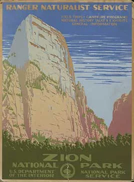
Zion National Park, Ranger Naturalist Service
The cliff provides an immediately recognizable focal point. Compare its scale against the compressed destination typography.
Independent interpretation. Source facts and full attribution are on the creative record.
 Open work ↗View Original ↗ · Library of Congress
Study 2
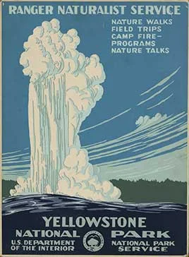
Yellowstone National Park, Ranger Naturalist Service
The geyser creates a strong vertical movement. Supporting text adds practical reasons to visit rather than repeating the image’s promise.
Independent interpretation. Source facts and full attribution are on the creative record.
 Open work ↗
Powell, C. Don (Chester)
View Original ↗ · Library of CongressStudy 3
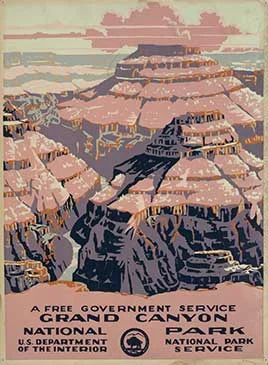
Grand Canyon National Park, a free government service
Layered landforms give the destination depth. Look at how broad color areas simplify a complex physical landscape.
Independent interpretation. Source facts and full attribution are on the creative record.
 Open work ↗
Powell, C. Don (Chester)
View Original ↗ · Library of Congress